
INTERNet
Designed an intuitive job review platform for students, reducing user pain points by 62.5%. The platform enabled easy comparison of detailed internship and entry-level reviews, empowering more informed career decisions.
Duration
July-September 2025
My Role
UX Designer
Project Type
Solo Personal Project
Tools used
Figma, FigJam, Notion
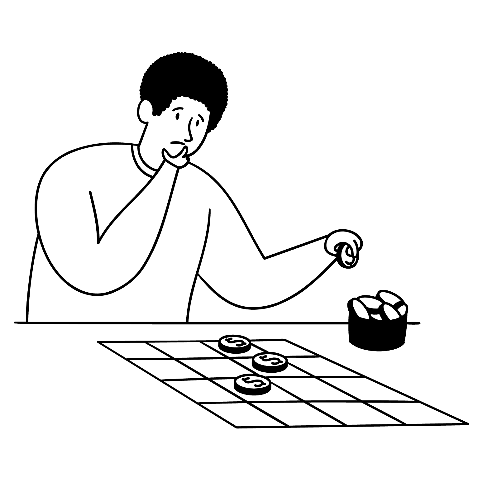
No job platform specifically targets internships or entry-level jobs.
It could be scary to step outside your comfort zone.
This made me think…
Target market
Detailed reviews of internships and entry-level roles about various job and company aspects, written by current or former employees of the company.


Each review is rated, color-coded, and has filter and sort options for easy search.
(INTERNet is heavily inspired by USTspace. It is a course review platform for HKUST students. UST students greatly rely on this website to make informed decisions for course registration every semester!)
+100%
28.8%
62.5%
User interview
I conducted user interviews with five participants, who are currently students or recent graduates, about the challenges they face in job hunting and what they want to know before applying for a job.
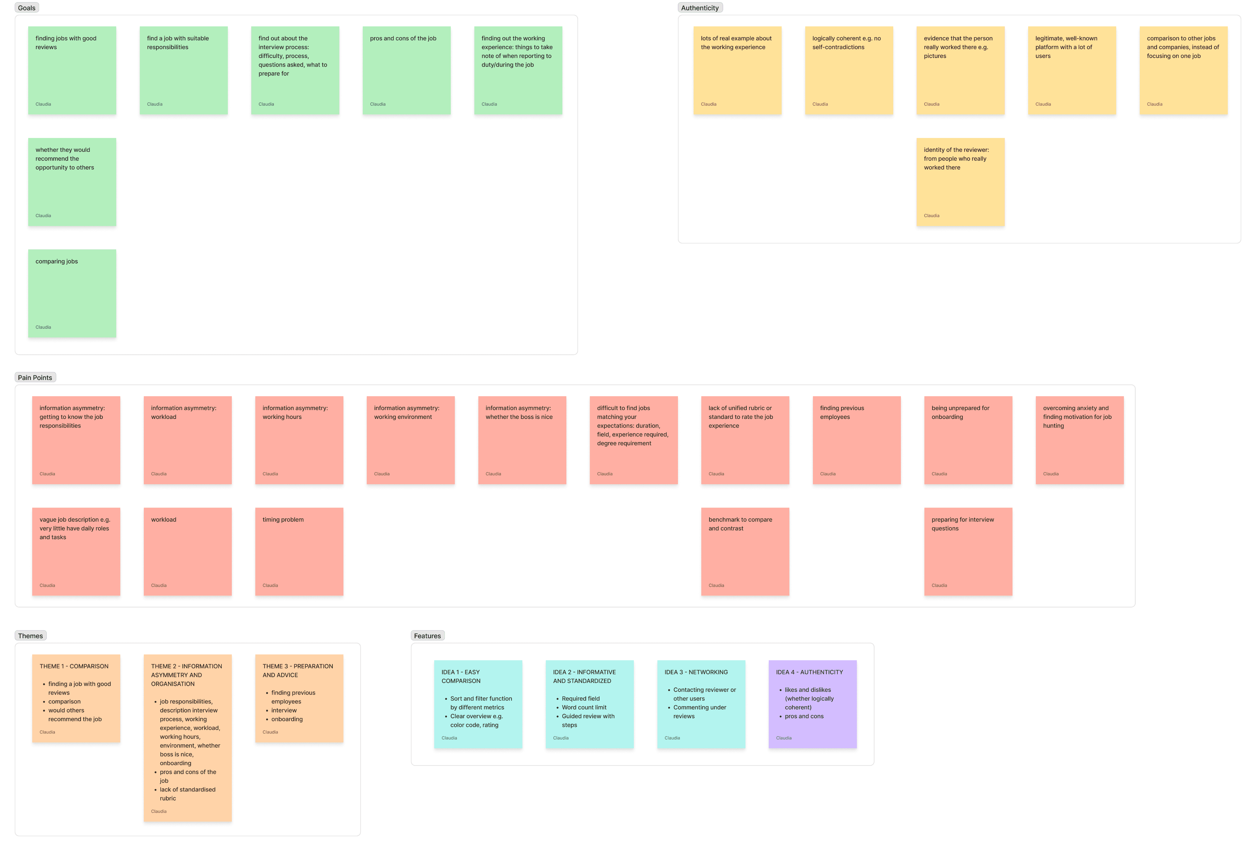
Users need reviews that cover every factor they care about when evaluating a role
Users need an easy way to compare reviews on different jobs and companies
Usability Testing
I conducted usability testing by giving five users three key tasks to complete and asking questions afterwards. I then used post-it notes in FigJam to visualize user insight.
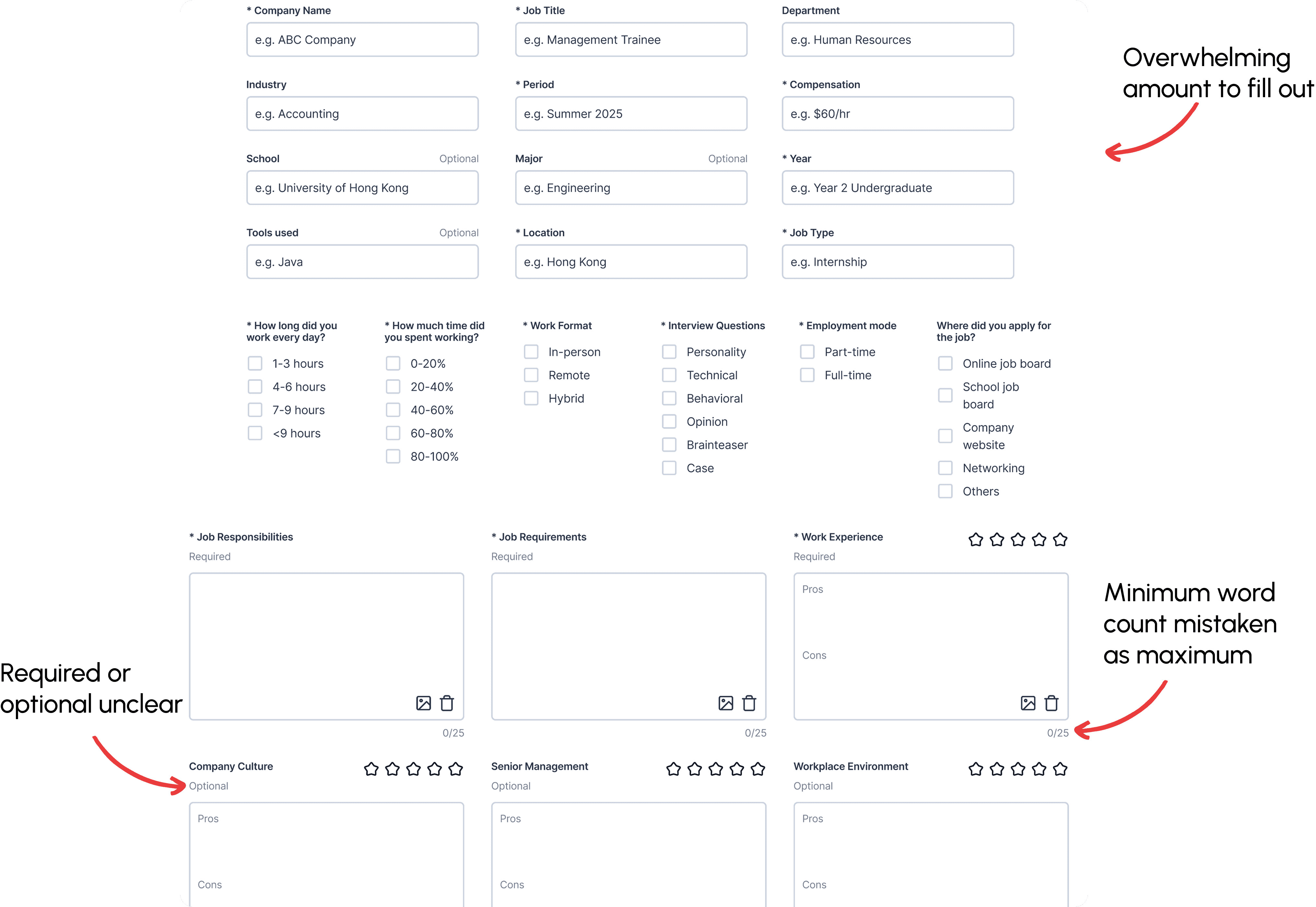
Review content was hard to read and digest.
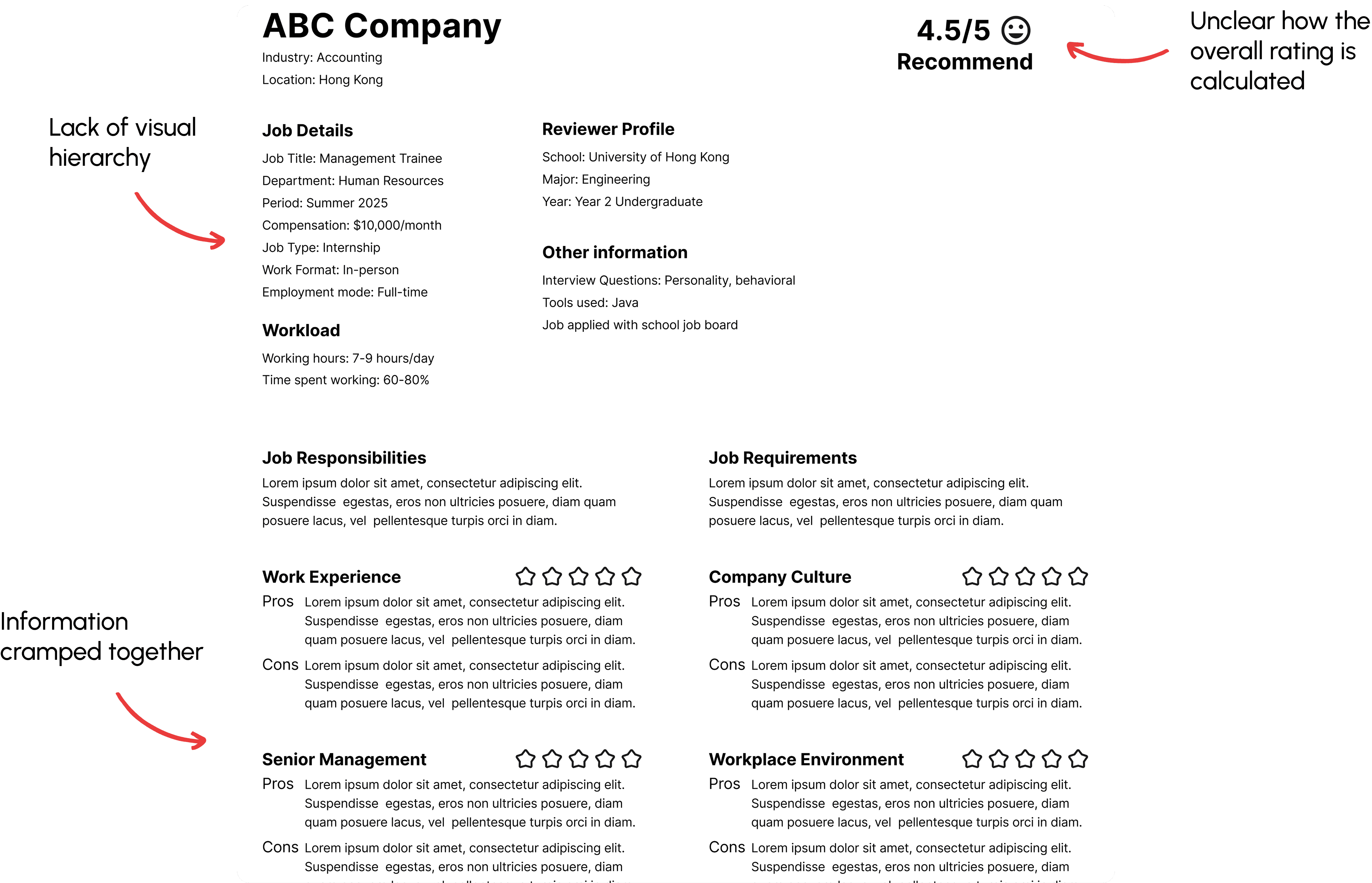
Everything was cramped into one page and there was too much to fill out. The instructions were unclear. This could lead to high abandonment rate in the future.
Hi-fi Prototype
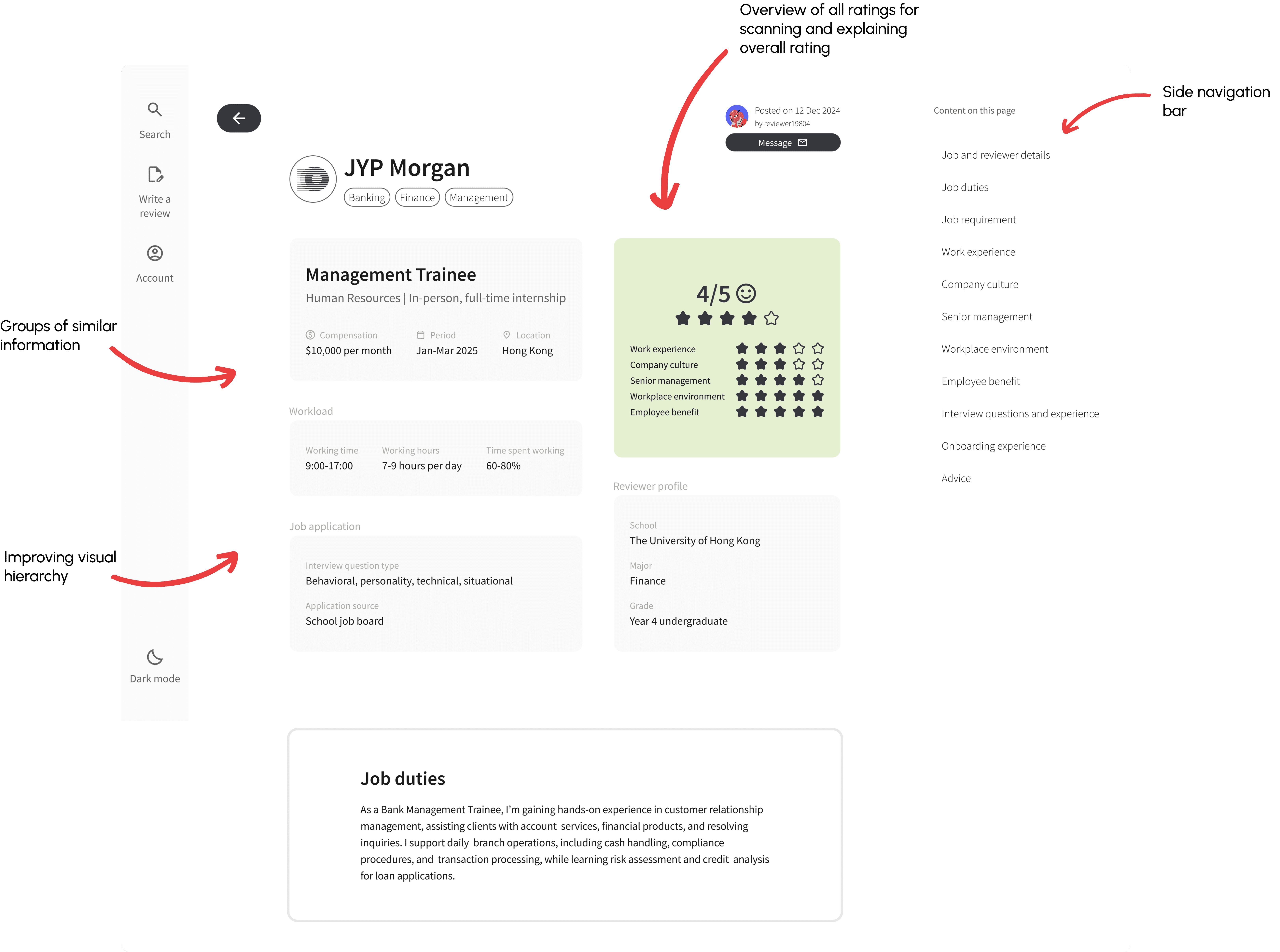
Overview of overall rating and metrics
Side navigation bar
Grouping similar job details
Improving visual hierarchy
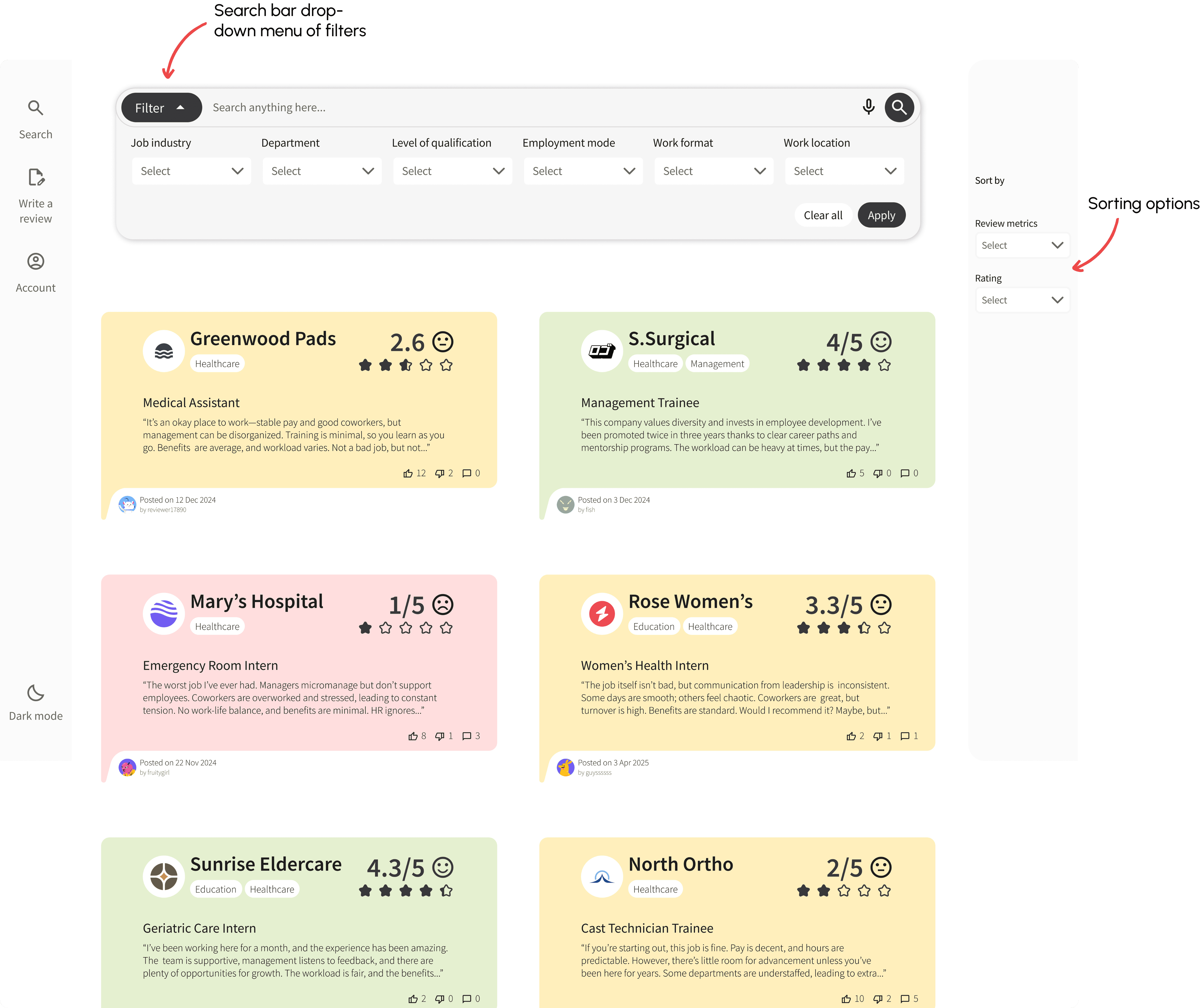
The filters are part of the drop-down menu from the search bar, decluttering the page
Sorting options of review metrics and ratings
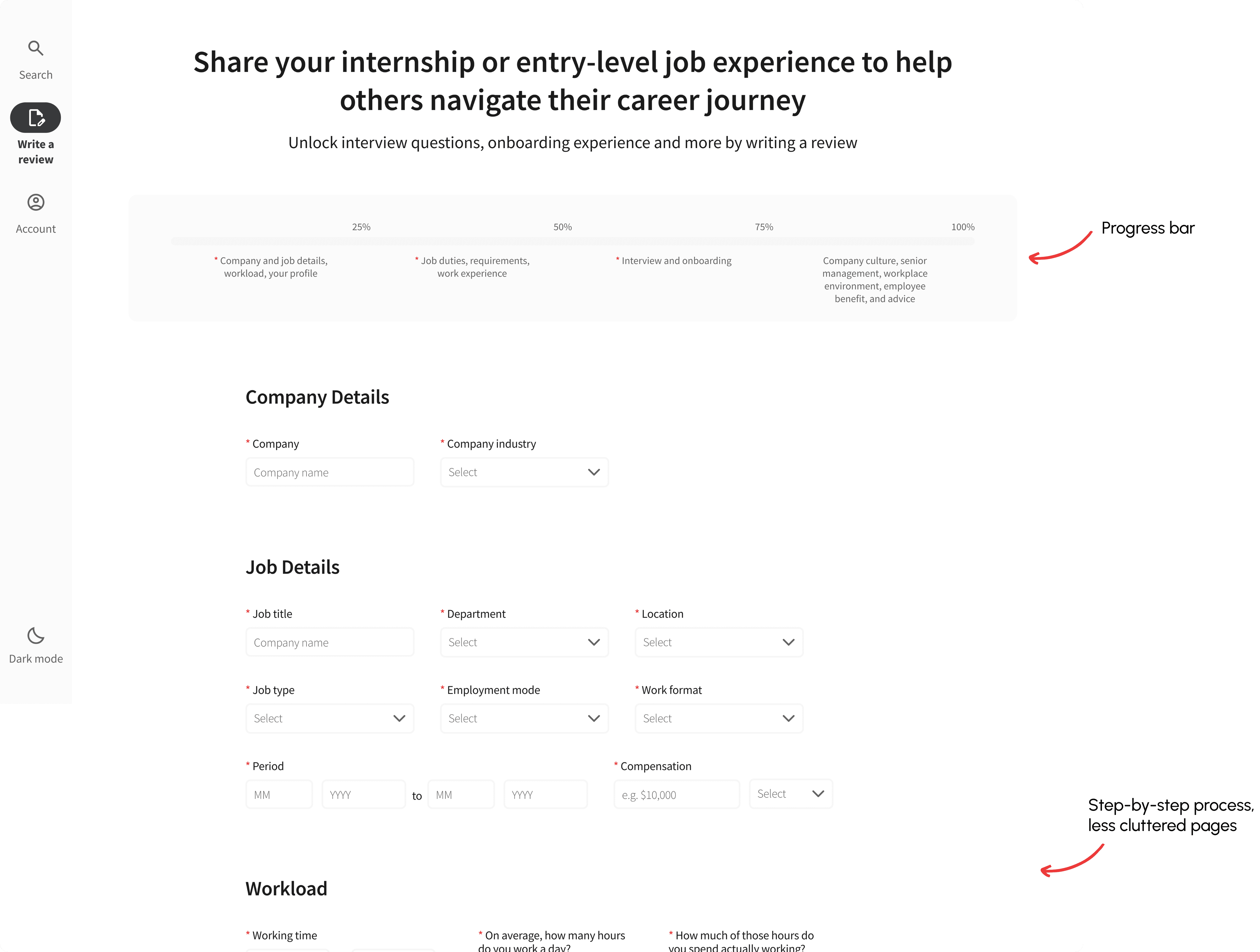
Separating pages into a step-by-step process
Adding a progress bar up top
Final Design
Company’s information, overall rating, and each metrics
Divider to organize information instead of gray blocks
Review verification for authenticity
AI summary for easy overview
Sorting is placed in the middle, above reviews
Default sorting to avoid confusion
Smaller reviews for easier browsing
Changed the red, yellow and green to a sharper, less pastel color to appear more professional
Colors only on the rating for better association
Changed the color of the stars
Less rounded corners
There is a design system and UI element kit for easy reference and future use.
The review-writing process needs more improvement. Here's the data I would be interested in collecting:
Task success rate: A user goal would be submitting job reviews. This is crucial because more reviews need to be submitted to keep the website operating and the business growing.
Time on task: A longer average time may indicate inefficiency and potential abandonment.
Avoid AI for writing questions. Firstly, AI can create bias. E.g., ‘How easy was it to browse reviews?’ The word ‘easy’ could lead to bias. Secondly, AI writing is usually wordy and indirect. E.g., ‘What do you hope to achieve with the platform?’ This can be improved by saying ‘What do you want to know when browsing a job review?’ I don’t use AI for writing questions anymore, as it can also be detrimental to my creativity.
If there were a product manager, they might call out the importance of the review-writing process. This was not the main design solution to the problem, but the number of iterations was surprisingly high. In hindsight, this might be a bias because I’m someone who never engages with the online community through posting or writing comments. This makes me unfamiliar with the process and underestimates its importance. Major task flows should be identified during the early stages of design.